Let's be honest—most startups launch with a product that works but looks, well, like a startup. There’s nothing wrong with that initial "learn as you go" phase, but eventually, your design starts to hold back your growth.
That’s exactly where Reacher found themselves. Their AI-powered TikTok Shop affiliate platform was already delivering impressive results for clients (we're talking $20M+ in GMV), but their interface didn’t reflect that success.
The Challenge: Success Without the Look to Match
By the time Reacher reached out to me, they were already an official TikTok Shop Partner with a powerful product connecting brands with creators. The problem? Their platform looked like it was built by engineers for engineers (and no offense to engineers—I’ve got mad respect for them).
As Reacher’s founder Jerry put it:
“We went from looking like a startup to having a professional, polished app that people take seriously. It’s been a game-changer for our brand.”
The disconnect between their premium service and the interface was causing real business problems:
Potential enterprise clients were hesitant during demos
User onboarding was taking too long
Their team was spending too much time explaining functionality
The design didn’t reflect their status as an official TikTok partner
Data table — Before.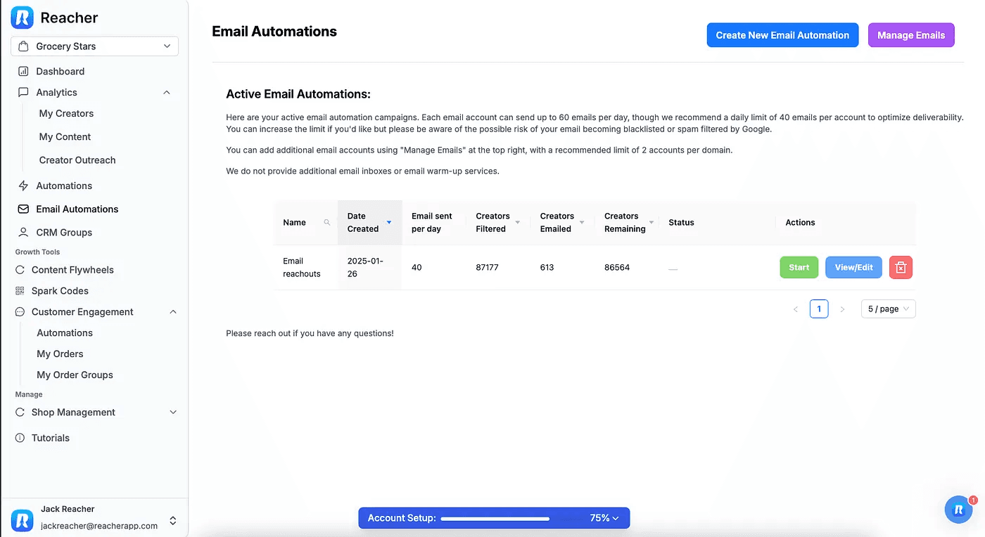
The Solution: Product Design That Means Business
Through my partnership with Reacher, I focused on three key areas to address these challenges:
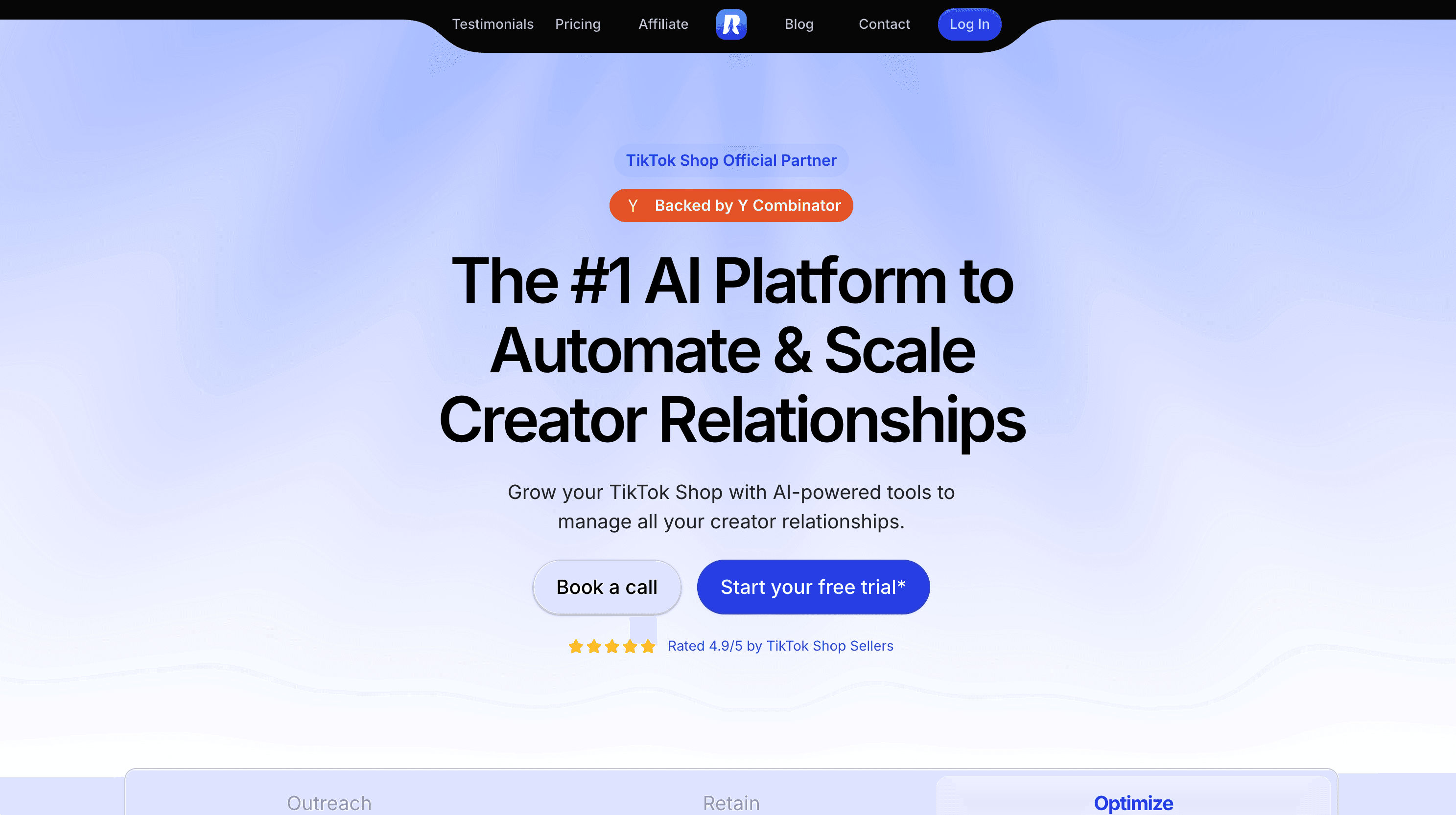
Elevating the Visual Design Language
We started by creating a cohesive design system that:
Established a professional color palette that aligned with their brand while elevating it
Applied consistent typography, spacing, and layout
Created reusable components to scale with feature growth
Added subtle animations and microinteractions to give a premium feel without being over-the-top
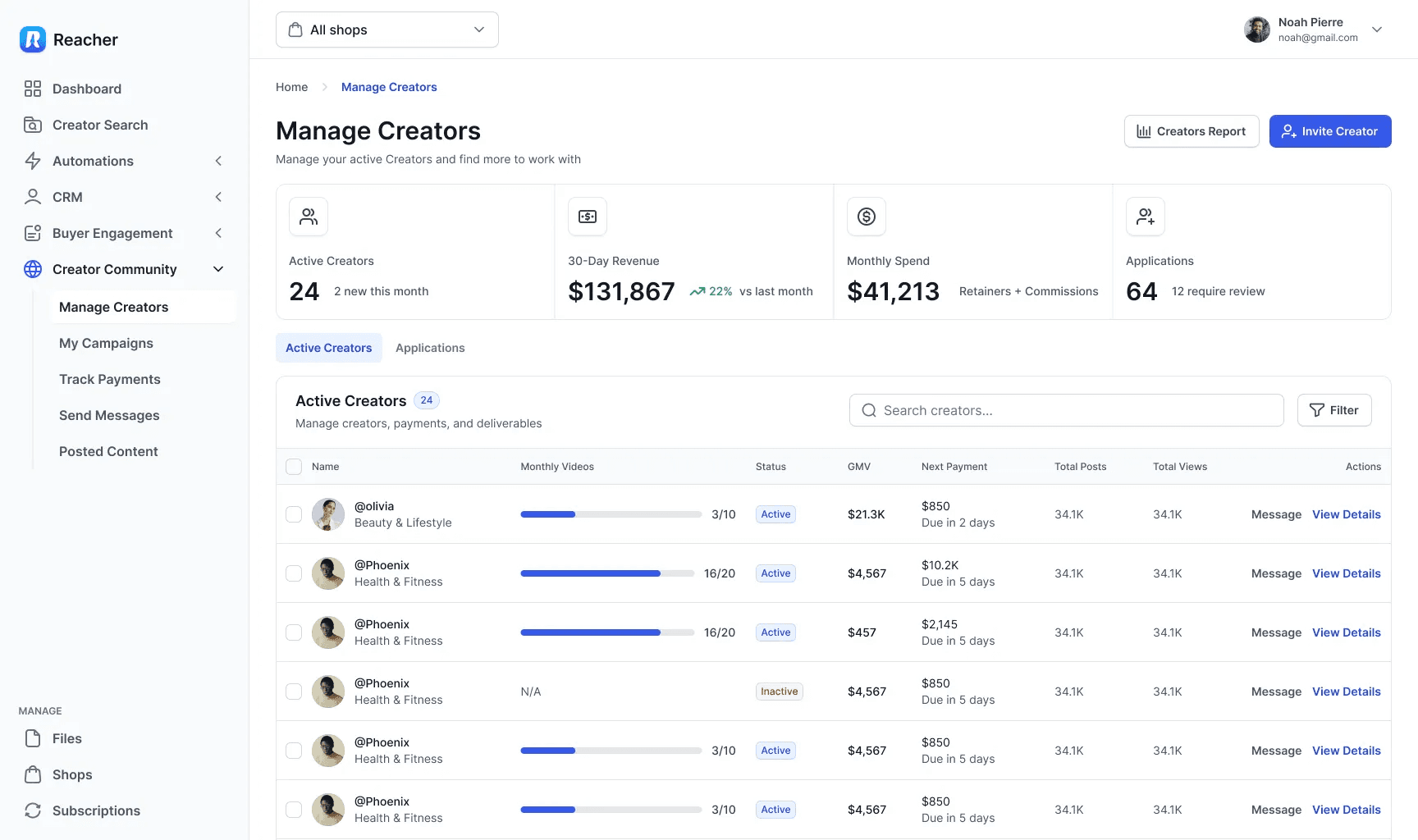
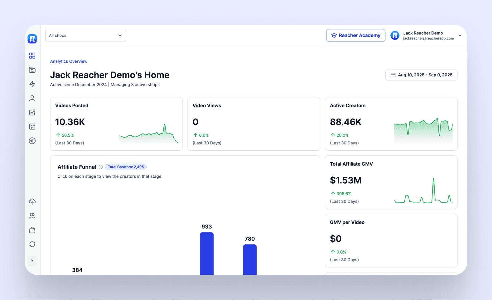
Data table — After.
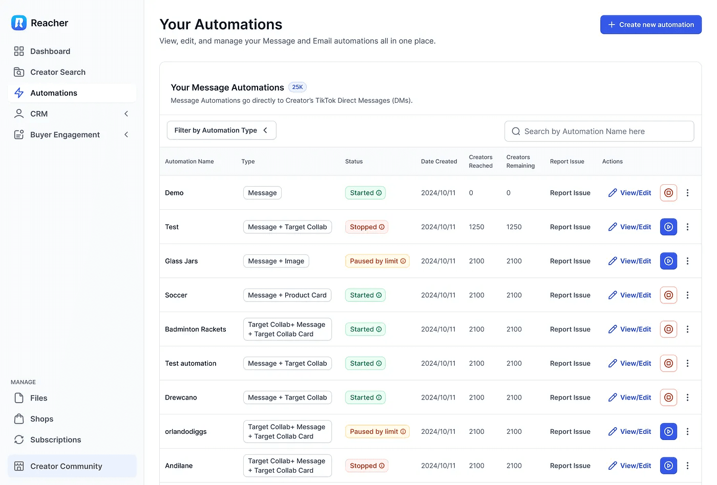
Streamlining User Flows
The real magic happened when we reimagined core user journeys:
Simplified the creator outreach process from 7 steps to 3
Created a dashboard that surfaced the metrics that actually mattered
Designed an intuitive CRM interface that reduced training time
Built content flywheel templates to make campaign creation super simple
Knowledge Transfer (Because What Good Is Design if Nobody Gets It?)
As Jerry mentioned:
"He’s always taking time to help the whole team understand design principles through meetings and explanations."
I didn’t just drop designs and leave. We:
Ran bi-weekly design workshops with the development team
Created a living design system documentation
Established design principles specific to Reacher’s users
Set up collaborative critique sessions to keep improving
The Results: Design That Drives Business Metrics
After six months of working together, Reacher saw:
A 50% increase in Monthly Recurring Revenue (MRR)
Significant reduction in churn rate
Improved conversion from free trials to paid plans
Faster onboarding times for new customers
Positive user feedback specifically mentioning the interface
The Secret Sauce: Design That Goes Beyond Aesthetics
I’m not just about making things look good. What I brought to Reacher was product design in its truest form—aligning business goals, user needs, and technical feasibility.
As Jerry put it:
“He’s not just a UX designer—he’s a true product designer who really understands our vision.”
I didn’t just redesign screens; I redesigned entire experiences. We didn’t just pick nice colors; we created a visual language that communicated Reacher’s value at every touchpoint.